Introduction
The Soft Summer Color Palette
Have you ever stood in front of your wardrobe, stared at all those clothes, and still felt like something was off? Maybe the colors felt too loud, too harsh, or just… wrong. If that sounds familiar, you’re not alone. Many people struggle not because they lack style, but because they haven’t found the shades that truly harmonize with their natural features.
“The Soft Summer Color Palette “That’s where this guide comes in. We’re going to talk about one of the most calming and wearable color families out there—often loved for its quiet elegance and effortless charm. Think of it like a misty morning by the sea: peaceful, balanced, and never overwhelming. Ready to explore? Let’s dive in.
Understanding Seasonal Color Analysis in Simple Terms
Before we get specific, let’s take a quick step back. Seasonal color analysis is a way to group colors based on how they interact with natural traits like skin tone, hair color, and eye color. The idea is simple: some shades make you glow, while others drain the life out of your face.
Think of colors as lighting. Just like the right light can make a room feel warm and welcoming, the right shades can make you look fresher and more vibrant—without makeup or effort.
The “summer” family sits on the cooler side of the spectrum, and within it, there are softer color, more muted variations that feel gentle rather than bright.
What Makes This Palette Unique?
So what sets this color family apart from others?
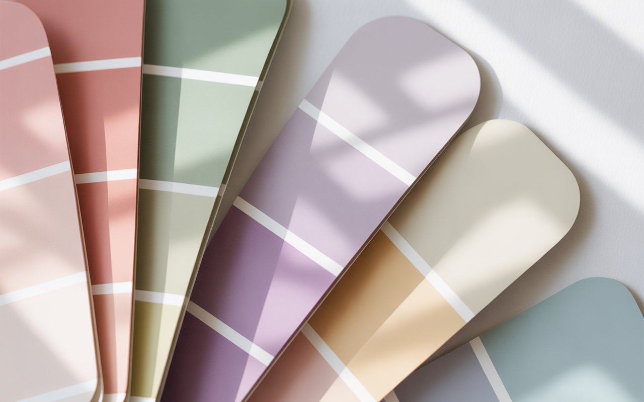
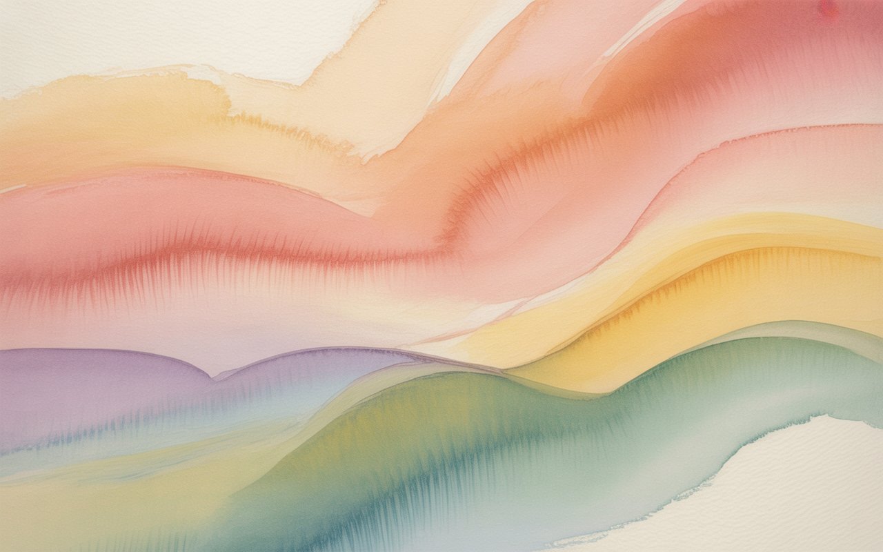
It’s defined by cool undertones, muted intensity, and light-to-medium value. Nothing feels sharp or extreme. Instead, everything blends smoothly, like watercolors softly bleeding into one another.
If bold jewel tones feel like shouting, these shades feel like a calm conversation. They don’t compete for attention—they complement.
This palette is ideal for people whose natural coloring is low-contrast. That means hair, skin, and eyes are different, but not wildly so. Everything feels cohesive rather than dramatic.
Who Naturally Fits These Shades Best?
You might be wondering, “Is this me?” Let’s break it down in everyday language.
People who shine in these colors often have:
-
Fair to light-medium skin with cool or neutral undertones
-
-
Eyes in shades of gray, blue, soft green, or hazel
But here’s the thing: you don’t need to fit into a strict box. Lighting, makeup, and even hair dye can influence how colors behave on you. If softer, dusty tones make you look rested and pulled together, you’re probably in the right place.
Key Characteristics of the Color Family
To really understand this palette, it helps to look at its three defining traits:
Softness
Nothing is neon or intense. Colors feel slightly gray-toned, like they’ve been gently filtered.
Coolness
Warm, golden hues usually feel out of place. Instead, there’s a subtle blue or rosy base underneath.
Balance
There’s no extreme lightness or darkness. Everything sits comfortably in the middle, making it very wearable for daily life.
Imagine a cloudy sky just before rain—there’s depth, but it’s never harsh.
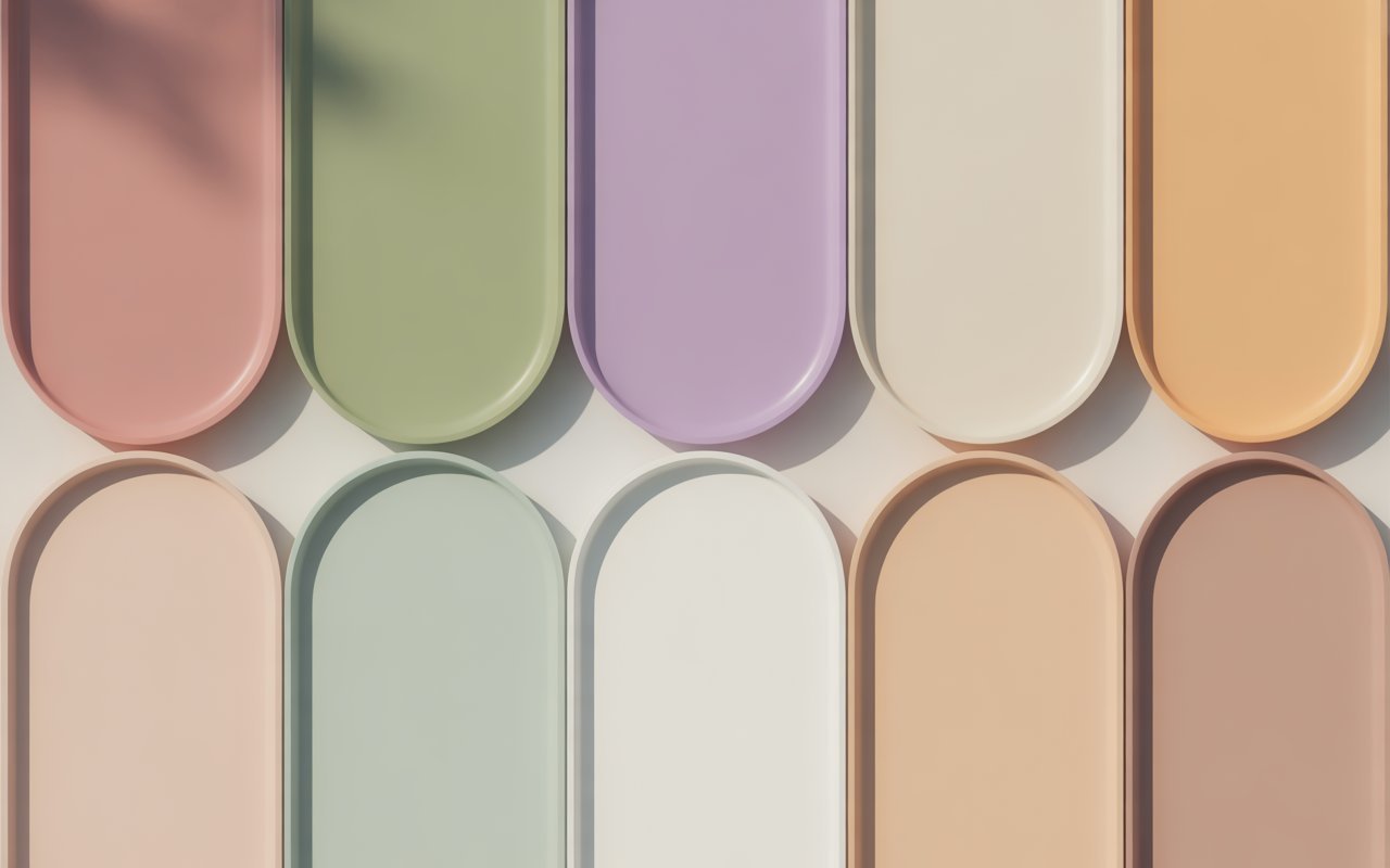
Core Colors and Their Emotional Impact
Every palette has its heroes—the shades that do most of the heavy lifting.
You’ll often see:
-
Dusty blues that feel calm and trustworthy
-
Soft pinks that resemble rose petals rather than bubblegum
-
Lavender and muted plum tones that add elegance without drama
-
Cool grays that feel refined instead of dull
These colors have a quiet emotional impact. They don’t overwhelm the senses. Instead, they create a sense of approachability and grace, which is why they work so beautifully in both personal style and design.
Neutrals That Truly Work
Neutrals are the backbone of any wardrobe. For this palette, the best neutrals avoid stark contrast.
What works well:
-
Cool taupe instead of beige
-
Mushroom gray rather than charcoal
-
Soft navy instead of true black
What to be careful with:
-
Pure white (too sharp)
-
Jet black (too heavy)
-
Warm browns (often clash with cool undertones)
Think of these neutrals as background music. They shouldn’t steal the spotlight, but they set the mood perfectly.
Colors That Are Better Left Aside
Just as important as knowing what works is knowing what doesn’t.
Highly saturated shades—like bright orange, neon green, or fiery red—can overpower softer features. Warm earth tones may also create a tired or uneven appearance.
It’s not that these colors are “bad.” They’re just speaking a different language. And style, at its core, is about harmony.
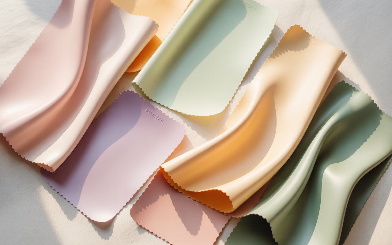
Dressing with Ease: Everyday Clothing Choices
Here’s where things get fun.
When building outfits, layering is your best friend. Combine different muted tones rather than relying on contrast. A soft blue top with a grayish-pink scarf and cool-toned denim creates depth without noise.
Patterns should be subtle. Watercolor florals, low-contrast stripes, or faded prints tend to work beautifully. Sharp geometric designs in high contrast? Not so much.
If you’ve ever felt most confident in clothes that feel “effortless,” this approach will feel natural.
Makeup Shades That Enhance, Not Mask
Makeup for this palette should look like an extension of your skin, not a costume.
Complexion products should lean neutral-cool.
Blush looks best in dusty rose or muted berry.
Lip colors shine in soft mauve, rosy nude, or cool pink tones.
Eyeshadows work beautifully in gray-taupe, lavender, and smoky blue.
The goal isn’t transformation. It’s enhancement—like adjusting the brightness on a screen until everything looks clear and balanced.
Hair Color Considerations
Hair color plays a huge role in how colors interact with your face.
Ashy tones—whether blonde or brown—tend to look harmonious. If you like highlights, keep them subtle and cool. Think champagne, pearl, or mushroom rather than gold or caramel.
Extreme contrast, like jet black or overly warm copper, can throw off the soft balance and make styling more challenging.
Accessories, Metals, and Small Details
Sometimes it’s the little things that make the biggest difference.
Jewelry in silver, white gold, or brushed metal often looks more cohesive than yellow gold.
Bags and shoes in soft gray, cool taupe, or muted navy blend effortlessly with outfits.
Prints and textures should feel matte or slightly worn rather than shiny or high-gloss.
These details act like seasoning in a recipe. Too much, and it’s overwhelming. Just enough, and everything comes together.
Applying These Colors Beyond Fashion
This palette isn’t limited to clothing—it works beautifully in other areas of life too.
Interior design: Soft wall colors, gray-washed wood, and muted textiles create calming spaces.
Graphic design: Gentle contrast improves readability without strain.
Personal branding: These tones communicate trust, empathy, and refinement.
It’s no surprise that people often describe these shades as “timeless.” They don’t chase trends. They outlast them.
Common Myths and Misunderstandings
Let’s clear up a few things.
One common myth is that soft palettes are boring. In reality, subtlety creates sophistication. Another misconception is that you can only wear cool colors. Balance matters—neutral-cool shades often bridge the gap beautifully.
And no, you don’t need to throw out your entire wardrobe. Small adjustments can make a noticeable difference.
Final Thoughts: Finding Beauty in Subtlety
Finding the right colors isn’t about rules—it’s about resonance. When shades echo your natural features, getting dressed feels easier. You stop fighting the mirror and start trusting it.
This palette is like a quiet friend who always knows what to say. It doesn’t demand attention, yet it leaves a lasting impression. And in a world full of noise, that kind of beauty is something special.
Frequently Asked Questions
What makes this color family different from other summer variations?
It focuses on muted tones rather than brightness, creating a softer and more blended appearance overall.
Can someone with medium skin tone wear these colors successfully?
Yes, as long as the undertone is cool or neutral and the overall contrast is gentle.
Is black completely off-limits?
Not strictly, but softer alternatives like navy or charcoal are usually more flattering.
Do these shades work well for professional settings?
Absolutely. Their calm and refined nature makes them perfect for workwear and formal environments.
Can this palette change over time as hair or skin changes?
It can shift slightly with age, hair color, or sun exposure, so reassessment every few years is helpful.