Introduction
Have you ever put on an outfit and felt instantly calm, balanced, and put together—without knowing exactly why? Chances are, the colors were doing most of the work. Among the many seasonal color families, one stands out for its quiet charm and understated beauty: the soft summer color palette.
If you’re drawn to dusty blues, muted roses, gentle grays, and cool taupes, you might already be living in this world without realizing it. In this guide, we’ll explore everything you need to know—from what defines this palette to how you can use it in fashion, makeup, and even home decor. Think of this as your friendly roadmap to a softer, more harmonious style.
Understanding the Essence of Soft Summer
Before we dive into specifics, let’s talk about the personality of this palette.
Soft summer paletle belongs to the seasonal color analysis system, which groups colors based on temperature (warm or cool), depth (light or dark), and intensity (bright or muted). This particular group is defined by three key traits:
-
Cool undertones
-
Low contrast
-
Muted, dusty quality
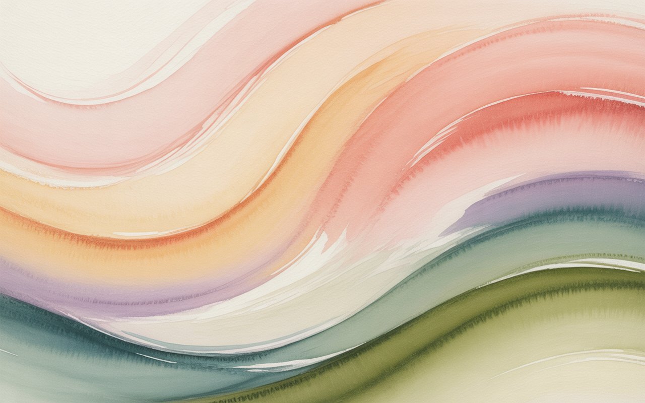
Imagine looking at a landscape on a cloudy afternoon. The colors aren’t bright or bold, but they’re incredibly soothing. That’s the vibe here—gentle, blended, and elegant.
Cool and Muted: What Does That Mean?
Cool colors have blue or gray undertones rather than yellow or orange. Muted shades are softened with a touch of gray, making them less vibrant and more subtle.
So instead of a bright cherry red, you’d see a dusty rose. Instead of electric blue, think misty slate. The effect? Refined and calm rather than loud or flashy.
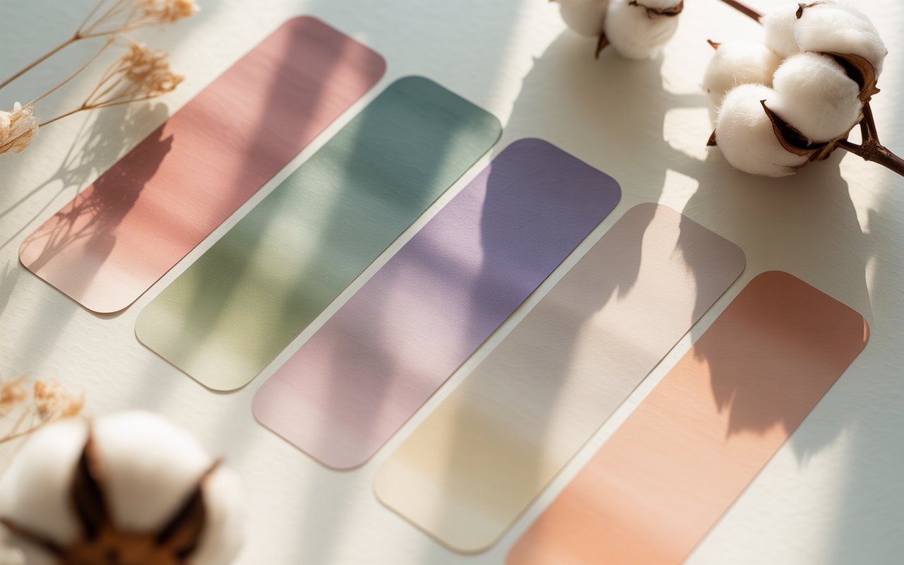
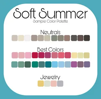
The Core Colors That Define This Palette
Let’s get practical. What shades truly represent this look?
Soft Neutrals
Neutrals form the foundation of any wardrobe. In this case, they include:
-
Cool gray
-
Taupe
-
Soft navy
-
Mushroom
-
Smoky charcoal
These aren’t harsh or stark. Even the darker shades feel blended and wearable.
Gentle Accent Colors
Accent shades add personality without overpowering. Some common ones include:
-
Dusty rose
-
Lavender
-
Powder blue
-
Sage
-
Mauve
-
Muted teal
Picture a bouquet left slightly out in the sun—still beautiful, just less intense. That’s the charm here.
How to Know If This Palette Suits You
 You might be wondering, “Is this actually for me?” Let’s explore.
Skin Undertone Clues
People who thrive in these colors often have:
-
Cool or neutral-cool undertones
-
Pink or rosy hues in the skin
-
A soft, blended appearance rather than high contrast
If silver jewelry looks better on you than gold, that’s often a hint.
Hair and Eye Harmony
Hair is typically ash blonde, soft brown, or cool medium brown—never overly warm or golden. Eyes might be gray, soft blue, muted green, or hazel with cool undertones.
The overall impression? Nothing stands out too sharply. Everything flows together gently.
Building a Wardrobe with Soft Summer Shades
Now comes the fun part—using it in everyday life.
Start with Basics
Choose jackets, trousers, and skirts in soft navy, charcoal, or cool taupe. These pieces will mix effortlessly with almost everything else.
Layer with Texture
Because the colors are subtle, texture becomes your secret weapon. Think:
-
Suede
-
Linen
-
Brushed cotton
-
Soft knits
Textures add depth without needing bold color.
Create Low-Contrast Outfits
Instead of pairing black and white, try gray and dusty pink. Instead of deep brown and cream, choose taupe and sage. The goal is harmony, not drama.
Makeup That Enhances, Not Overpowers
Makeup should feel like a gentle filter, not a mask.
Foundation and Blush
Look for neutral or cool foundations. For blush, choose soft rose or muted berry tones rather than bright coral.
Eyeshadow and Liner
Shades like:
-
Taupe
-
Slate
-
Soft plum
-
Smoky blue
These will enhance your eyes without overpowering your features.
Lip Colors
Dusty mauve, cool pink, and berry shades work beautifully. Avoid overly warm peach or bright orange.
Jewelry and Accessories: The Finishing Touch
Accessories can make or break the look.
Best Metal Choices
Silver, white gold, platinum, and brushed metals often complement cool undertones best.
Handbags and Shoes
Choose soft gray, cool brown, muted navy, or dusty blue. Even a soft burgundy can work if it leans cool.
Patterns should stay subtle—watercolor florals, gentle stripes, or faded prints.
Hair Color Ideas That Complement the Palette
Hair color can dramatically impact how these shades look on you.
Stay Ashy, Not Golden
Ash blonde, cool brown, and soft mushroom tones harmonize beautifully. Avoid brassy highlights or copper tones, which can clash.
If you color your hair, ask your stylist for a cool-toned finish with minimal warmth.
Using the Soft Summer Palette in Home Decor
Style doesn’t stop at clothing. Why not bring this peaceful vibe into your space?
Living Room Serenity
Think gray sofas, dusty blue cushions, and soft lavender throws. Add natural wood with a weathered finish.
Bedroom Calm
Soft mauve bedding, cool white walls, and muted artwork create a restful environment.
It’s like wrapping your home in a gentle fog—comforting, never overwhelming.
Comparing Soft Summer to Other Seasonal Palettes
Understanding contrast helps clarify what makes this palette unique.
Versus Bright Summer
Bright summer is clearer and more vibrant. The softer version feels more blended and toned down.
Versus Soft Autumn
Soft autumn also uses muted shades, but they lean warm—think olive and rust instead of sage and dusty rose.
The key difference? Temperature. One is cool, the other warm.
Common Mistakes to Avoid
Even with a beautiful palette, it’s easy to slip up.
Wearing Black as a Default
Pure black can look too harsh. Try charcoal or soft navy instead.
Choosing Neon or Highly Saturated Colors
Bright shades overpower your natural softness. If you love bold colors, wear them away from your face—like in shoes or bags.
Ignoring Undertones
Warm beige, golden yellow, and orange-red can clash. Always check for cool undertones.
Why This Palette Feels So Effortless
There’s something quietly powerful about subtlety.
In a world full of loud patterns and flashy hues, soft summer feels like a deep breath. It doesn’t demand attention—it earns it through harmony.
Think of it like background music at a cozy café. You don’t consciously focus on it, but it shapes the entire mood.
When your colors match your natural features, you don’t have to try as hard. Your skin looks clearer. Your eyes seem brighter. Your overall look feels intentional, even when it’s simple.
Final Thoughts: Embracing Your Natural Harmony
The soft summer color palette isn’t about strict rules or limiting choices. It’s about discovering what already works with you, not against you.
When you choose cool, muted, and low-contrast shades, you’re creating balance. You’re letting your natural features shine instead of competing with them.
So next time you’re shopping or redecorating, ask yourself: does this color feel gentle and blended? Does it harmonize rather than dominate?
If the answer is yes, you’re probably right at home in this serene and timeless palette.
FAQs
1. What is the main characteristic of a soft summer color palette?
The defining trait is cool, muted shades with low contrast. The colors are blended and slightly gray-toned rather than bright or intense.
2. Can soft summer wear black?
Pure black can appear too harsh. Softer alternatives like charcoal or soft navy usually look more flattering.
3. Are pastel colors suitable for soft summer?
Some pastels work well if they are cool and muted. Bright or overly sweet pastels may feel too strong.
4. How is soft summer different from soft autumn?
Both use muted tones, but soft summer leans cool while soft autumn leans warm. Temperature is the key difference.
5. Can someone with dark hair belong to soft summer?
Yes, as long as the hair has cool undertones and the overall contrast remains soft rather than dramatic.